The Friendship of Nature by Mabel Osgood Wright is available digitally on HathiTrust. The content of the book is copied exactly as it is in the book, however there are certain differences between the online and physical text that change the way it is interacted with. The front cover and the portrayal of the exterior of the book is one of the most obvious differences between the two texts, as well as the general delivery of the text, in which the pages look significantly different. These changes between the physical and digital copies impact the interaction of the reader and the text, as the digital copy doesn’t pick up the subtler purposes of the design of the physical text.
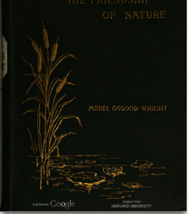
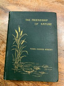
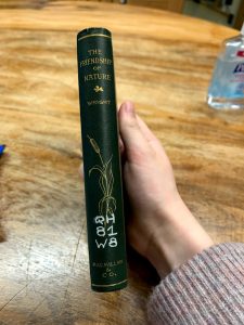
The cover of my copy of The Friendship of Nature draws readers in with it’s simple yet charming illustrations in gold of a lily pond. Giving the first impression of a book about the wonders and beauty of nature, this front cover was crafted to set the scene of the book ahead. The poetically graceful text of the book is represented by this pretty front cover, and the digital version completely throws it all away. It’s dark, turning the woodsy green to a much gloomier shade. The illustration can still be seen, although not in its full capacity, but the top half of the title is almost cut out fully. The spine is not included in the digital copy, leaving out the illustrations that are seen on the physical one. While this may not seem crucial, the beauty of the spine added to the elegance of the appearance of the book. It also lets readers know that the book was crafted to be shown off, as the illustrations on the spine would look nice on a bookshelf to be seen. Comparing the two covers made me think about the purpose of the color choices with the copy I looked at. The rich green of the physical copy matches that of a pine tree, making readers think about the outdoors even if they are reading inside. This commitment to dedicating the book to nature is lost in the digital copy, whose dark and gloomy introductory cover does not inspire readers to connect the text to nature but instead sets up the text in a more pointed, direct way that leaves out any of the imagination portrayed in the text of the book.
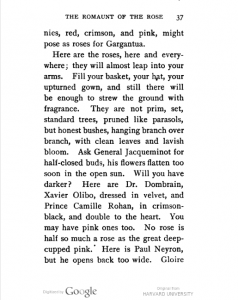
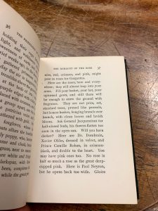
Another large difference I noticed between the two texts is the delivery of the text itself. In the copy from Special Collections, the pages are slightly aged-looking, a mellower yellow that carries the content of the text much softer than the digital version, which has bright, scanned white pages. This tiny difference in the color of the pages completely changes the atmosphere of the text; the physical copy is seemingly meant to be read for pleasure, while the fluorescence of the digital copy reminds me of scholarly texts that serve the purpose of informing readers. This gives the digital copy the impression of being something to be studied rather than something to be read, which changes the way in which readers interact with the text.