
At the Beginning…
Surprising as it may sound, I, as a Chinese, “suffered” a lot from the sophisticated writing of my own language when I was little. During my primary-school-year, the most popular jokes among us were that someone didn’t finish his/her exam because they had spent too much time trying to remember how to write their names correctly. My name, 潘思媛 (Pan Si Yuan in the official romanization system Pinyin, with “Siyuan” as the first name and “Pan” as the last), contains over 35 strokes in total. It is not considered as a complicated one, however, because of the characters’ structures are prevalent. My family name, “潘,” is composed of the radical “氵” and the character “番.” The second character of my first name, “媛,” is also a left-right structure with the radical “女” and the part “爰.” The other one, “思,” is a typical up-down structure with “田” and “心.” Some of these parts indicate the meaning of the character, while others suggest the sound.
Above is what I said in my public-speaking course in 2016, when I made my first attempt to explain the mechanism behind Chinese characters to my European and American classmates. If English words are composed of twenty-six Latin letters, then may I divide Chinese characters into different parts to make it easier for a non-Chinese-speaking audience to grasp the point?
When I started tutoring Chinese at Colby College, I have applied this idea during the sessions. Separating and writing down complicated characters part by part largely helped my tutees understand their meanings and to memorize the writing, but the separation posed another question: the structure. This is also the most significant challenge I faced in my unessay project, and it eventually leads me to a different conclusion.
The Challenge
My unessay project, as I have introduced in my prompt and Moodle post, focus on carving basic strokes as well as radicals in Chinese on the erasers, and then try to find out how many characters I can form by integrating them. But when I started my exploration, I realized that I have been ignorant of the difference between hand-writing and printing characters at the very beginning. When one is writing by hand, whether in English or Chinese, it is relatively easy to control and adjust the distance between a character’s several parts. But printing with typefaces or plates is a different story. An example in English would be the word “award” and the phrase “a ward,” in which an unintentionally added space could result in a complete change of meaning. The same problem occurred in Chinese as well.
Going deeper, I had found another issue when I started rethinking the idea of integrating different parts into one character. Latin letters are written or printed fixedly, meaning that they appear precisely in one form, no matter as an individual word, “a” or a part of a longer-term “award.” But Chinese is different. The character “女,” is also a part of my name, “媛,” and another common-used character, “委.” The distinction may not be apparent when looking at these three typed characters on the computer screen, but in fact, the character “女” adopts different sizes depends on where it is in character. If it belongs to a left-right structure, then “女” would be narrower, while in an up-down structure, “女” would be shorter and wider. This distinction does not matter that much in my little project. However, imagine, if one is trying to build a whole set of plates and reuse them to produce different characters, they may need to create different typefaces for one part/character because of the various locations. It affects not only the aesthetic aspect but also the meaning, which is fundamental to the function of language.
Therefore…
My unessay project becomes very different from what I had expected when I first thought of it. Instead of trying to integrating, I will simply compare carving some Latin letters and Chinese characters on the eraser and print them on two kinds of paper. I have not realized my ambitious goal of copying a poem due to a lack of time, but I will definitely try it later. And below is my preliminary exploration of craving and pressing.
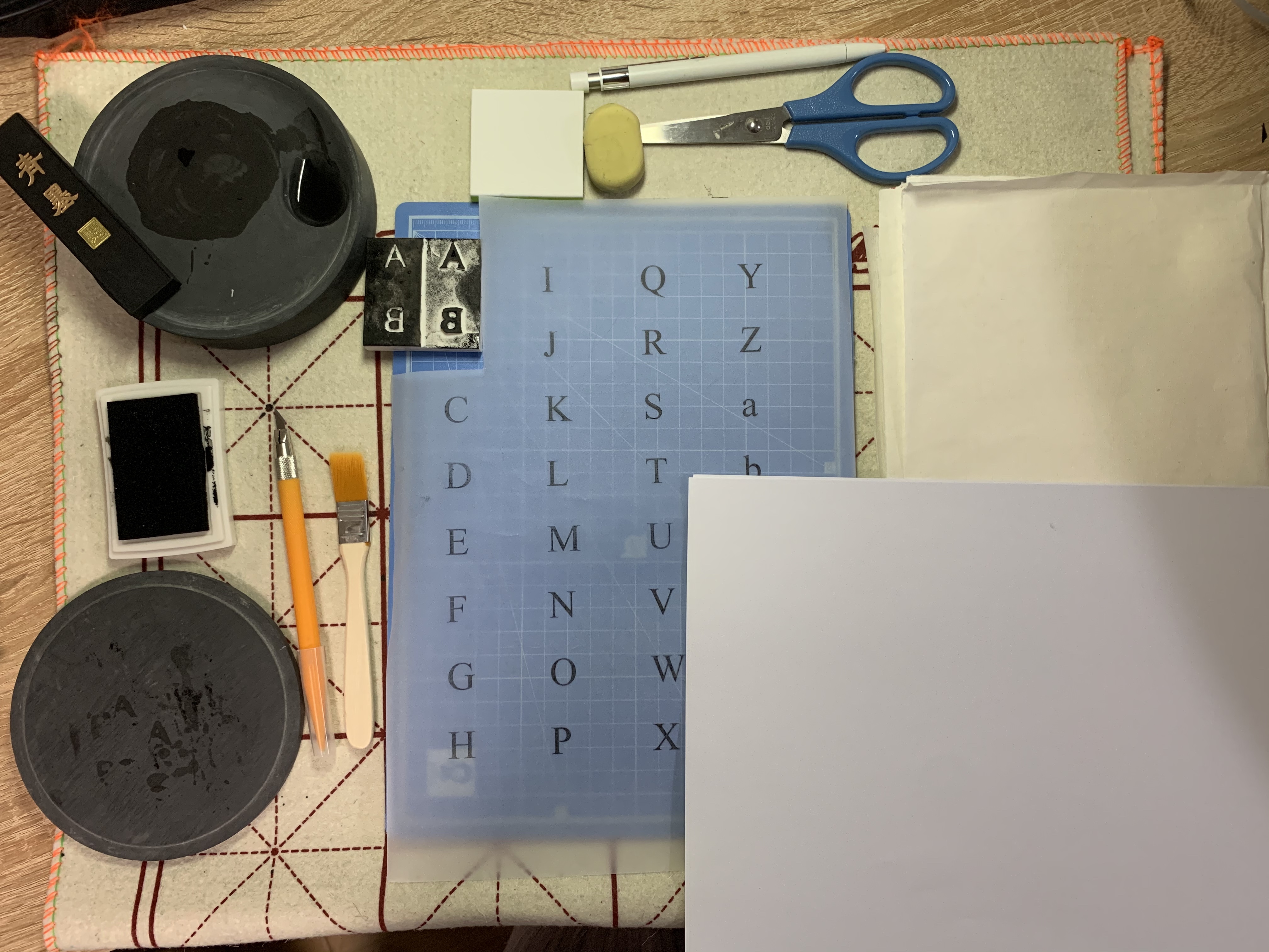
The materials:
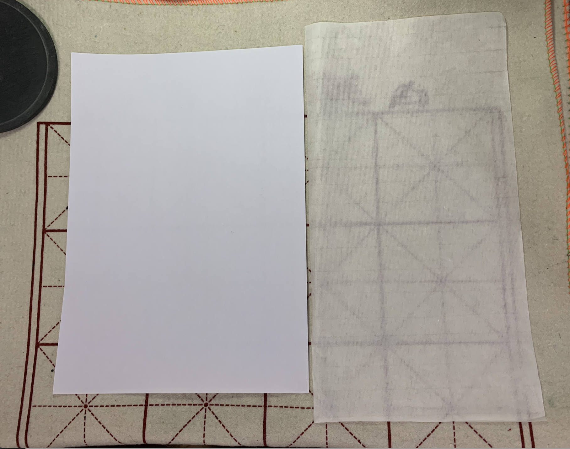
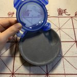
– some regular A4 white paper and some Chinese paper (known as Xuan paper ) that is made for Chinese calligraphy or traditional painting practice (see Figure 1.)
– standard ink for pens and ink ground from an inkstick
– different-shaped erasers
– a knife
– a paintbrush that I used to put the ink on the eraser
– an inkstone, a pencil, scissors, a hard surface
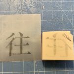
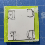
1 – Carving
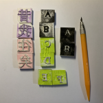
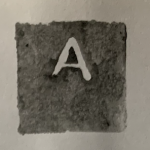
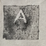
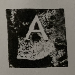
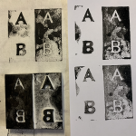
First of all, I need to draw out the characters and the letters backward. I printed out them using a printing machine (thanks to modern technology) on a thin, transparent paper. I press the paper on the eraser to get the basic shape of the picture. Then, I outlined the whole design with a pencil and started to carve. After finishing some, I gradually became familiar with the process and learned how to manage the details, like the particularly thin parts. The erasers I bought have a different color on the surface, so I could easily tell which part has been carved out (see Figure 3-2. and 3-3.). I have also tried two ways of carving with the capital letter A and B (see Figure 3-4.) because I want to experiment with relief-printing and intaglio, but I did not succeed with the latter.
Nevertheless, I have severely underestimated the time it would take for me to finish one piece. One capital Latin letter took me about five to seven minutes, while the Chinese one cost, on average, 23 minutes. Also, I was carving on erasers, which are much softer than wood or metal. How time-consuming the real process is struck me, though I am sure that skilled workers could finish much quicker than I did.
2 – Printing/Pressing
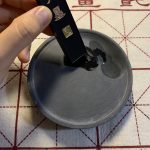
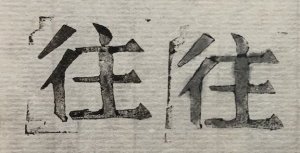
The printing part was fun, but harder than I thought. I have tried standard ink and ink from an inkstick on regular A4 paper and Xuan paper. In general, A4 paper and ink for pens produced the most precise image, while the Xuan paper absorbed too much water that created uneven edges (see Figure 4-1.). Making ink from an inkstick is actually tricky since I need to grind the stick against the inkstone first, then decide how much water to add in the liquid (see Figure 5 1-4.). Besides, I found out that I could not press the erasers with even forces by my hands, and the images are lighter or darker in parts because of this.
About the type: I have chosen Times New Roman for Latin letters and the Song typeface for Chinese characters, as they are among the most common styles that we used today.
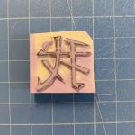
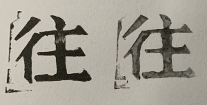
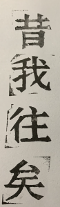
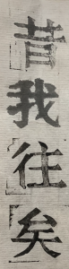
The four characters below is a line from the first stanza of an ancient Chinese poem. I will finish the whole poem and maybe some other works during the summer.
The End.
Little pieces of knowledge: I have failed to do intaglio printing since I cannot make the image that is incised into a surface with incised lines to hold the ink. Also, I think it would be easier to clean the ink from a metal plate instead of a wood one since the wood may get colored permanently. I decided to use a paintbrush to put the inkstick-made ink on the stamp because the ink had too much water in it. And I understood why people only use it for calligraphy or traditional Chinese painting.
With some left-right and up-down structure characters, putting different parts together into one character is still a plausible idea. In Thomas S. Mullaney’s The Chinese Typewriter, the author introduces different solutions regarding the non-alphabetic Chinese when engineers tried to invent the typewriter for it. The struggle of deciding the boundary of common usage and uselessness poses a question to both the linguistic and cultural fields. Although modern printing technology has almost completely replaced the old printing methods, we must not forget the efforts and attempts made by our ancestors to improve the printed language.
In the end, I would like to thank Professor Cook and all my classmates, without whom we could not have such a great class under this chaotic circumstance.
Work cited:
- Mullaney, Thomas S. The Chinese Typewriter: A History. The MIT Press, 2017. Project MUSE muse.jhu.edu/book/55599.