Sam McGrath Holmquist
Paratext
Alright we’re back. Let’s talk about this book. Celtic myth & legend, Poetry & Romance, by Charles Squire.
Today, let’s talk paratext. First, what is it?
In the case of our book, let’s start with the title page. Sorry, the title pages. We have two, one of them, illustrated! It’s beautiful. But even without the illustration, even if you couldn’t read, it’d still be beautiful. Look at the font, look at how well organized it is. I bet you could guess what sort of people this book was made for. Look! We have page numbers, too, and running headers (the chapter and section titles at the top of each page), and by the way, we have chapter titles and section titles. And footnotes. Holy cow! So that’s paratext. We’re talking about writing or aspects of writing in the book that are not technically part of the text. Page numbers, for example, or font, or the table of contents. Today we’re going to take a peek at the paratext in my pet book Celtic Myth & Legend, Poetry & Romance and we’re going to talk about what the paratext tells us. I think you will find that, as our author mentions in what appears to be his preface, the book wants us to find it important, groundbreaking, and hopefully, “agreeable” (Squire iii).
Cover Letters
Last time, we talked about the cover of our book, but let’s talk specifically about the title. Gold letters. And if you look at the letter “M,” our font gives it those fancy, in-turned legs that make it look all Celtic and Mythological. The “E” and the “Y” have a similar style, as you can see. Right from the start, our book sets its readers’ expectations, even at the level of font and capitalization. We have gold letters, all of them capital. The book is made to be precious, something to be collected. If you look inside, it’s even part of a collection!

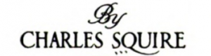
We also have two title pages, which are not particularly fancy, but are rather official. The first contains nothing but the title and white space. The font on this title page is capitalized, extremely neat, and minimalistic. It looks to me like copperplate gothic. No swirls, no punctuation, no embellishment. The second title page, which comes after a gorgeous illustration of “Lugh’s Enclosure” includes a mix of fonts. The title is in the same font as the letters on the cover, which looks distinctly Celtic to me, and the name of the author is in a similar font. The name of the publishing company is in that same discreet copperplate gothic font from the first title page.

![]()
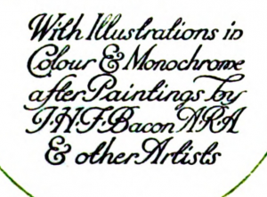
Finally, the title page also includes a reference to the book’s illustrations “in Colour & Monochrome” by some notable artists. The font you see above, the swirly one with lots of decoration, lends the book a sort of elegance, as though the history contained within ought not only to be learned, but to be cherished. The publishers, at least, want you to believe it is a beautiful history.
The cover may make a first impression on the reader, but the title page provides a sort of second impression, if you will. In contrast to the flashy and beautiful cover page, our first title page really tones things back. Then, the second title page brings back the Celtic font and a neat illustration. These first pages are likely designed to express some kind of authenticity. Obviously the book itself is not an ancient Celtic tome, but the titles pages communicate that this book has something authentically Celtic about it. At the same time, the more discreet fonts set a precedent. It says “Whenever I present you with strange and swirly Celtic fonts and other things, I will follow them up with a clear explanation that you can read.” In other words, those more discreet fonts make the book feel approachable, even while it feels authentic, old, and strange. Without reading a single page, we might already conclude that this book is for beginners, so to speak. For people who are new to Celtic mythology, who want a gentle but honest introduction to the mythos.
Preamble
Following the second title page, a preface introduces the to the book as a whole, although by the time we read the preface, we may already think quite highly of this book and look forward to its important and likely lovely contents. The preface establishes some amount of credibility for our author, even using roman numerals to mark the pages, which not only helps us navigate within the preface, but more importantly, keeps us from missing the fact that there is a preface and helping us find it easily, or helping us skip it easily. Since a preface signifies some degree of professionalism, we might conclude that the makers of this book want it taken seriously.
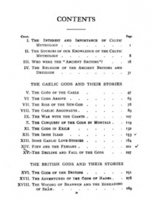
After the preface, we have a lovely table of contents, which stretches over two pages to keep itself from getting cramped. The table of contents gives us a preview of the various myths and poems we can find within, but as far as paratext, the table also notes the existence of an appendix, followed by both an index and a table of pronunciation (“FOR THE MORE DIFFICULT WORDS” (Squire x)).
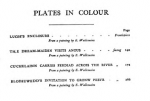
The table of contents is followed by a list of the colored and monochrome plates we find within. Some of the plates are photographs, but for those that are illustrations, the list includes the names of the artists. The title of each plate is in the copperplate we saw on the title pages, the discreet font that we decided is meant to be approachable. The artists names are in a smaller, italicized font, which not only makes them easier to read, but also makes them catch the eye. The table makes it very easy for one to find the artist behind a particular work of art, which makes sense if this book is an introduction to Celtic mythology, but also continues that feeling of authenticity. The paratext is exceptionally clear about who provided what artwork. Even if the artists are not Celtic, the paratext is so clear about this book’s origins that a reader can’t help but feel they are in good hands, like a tour guide, someone who knows the territory. This emphasis on authenticity and readability again point toward this book being an introduction, intended for audiences that are unfamiliar with Celtic lore but interested nonetheless.
Appendix, Index, Endex
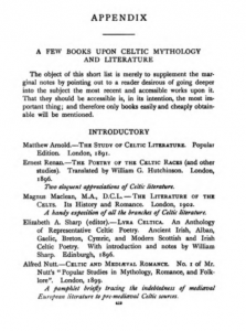
The appendix seems organized to help beginning researchers find their way to the most useful texts on Celtic mythology and literature. It begins with a list of “INTRODUCTORY” texts, for example, before moving to more specific topics, with little descriptions of the individual books (Squire 419). The whole vibe here is that these publishers want their book to be the starting place for people interested in Celtic myth, legend, poetry, and romance.
The index is cramped, as are most, I think, all alphabetized and organized into two columns. The table of pronunciation begins with a thorough and comprehensive page-long key for how to read its pronunciation guide. The guide itself is a list of words, in small font, organized like the index but with three columns and with the pronunciation for each word in parentheses. The whole thing is extremely comprehensive, but I found myself rather confused. I wonder now if the pronunciation guide is more of a gesture than an actual tool. The text is small, and the phonetic rules strange. Perhaps it would make more sense to someone reading it in the early 1900’s, but to me, it feels basically unusable. It is pretty, however, nice to look at.
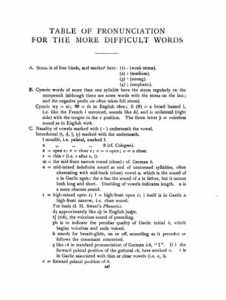
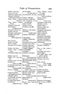
Now, it may be easy to forget, but the existence of this pronunciation guide means the book was not meant for people who could speak or even read Gaelic, natively or as a part of their studies. I am skeptical, however, that the pronunciation guide was meant to be used in the first place. It feels more like a novelty to impress whoever purchases the book, rather than a practical guide, which again makes us think about the intended audience for this book. It does not seem as though scholars are meant to consume it, but instead, ordinary people with a fair amount of money and a casual interest in the Celtics.
Footnotes
Last, let’s talk about foot notes.1
1. I first saw footnotes in a Norton anthology, which is to say, an academic text, and I think that in general, we can agree that footnotes scream academia. This book contains many footnotes, and many of them refer to other books, even giving page numbers for where to find certain, obscure information. The footnotes may seem insignificant, but they actually tell us something important about how people were supposed to read this book. A works cited page might appear at the end of an essay, if the reader is meant to finish the essay in one sitting, or at the very least, finish it. In our case, the footnotes appear on the same page as their respective quote or references, which tells us that people were meant to read this book in little chunks, perhaps bouncing around to different sections as curiosity demands. The book is perhaps also meant for research, but maybe not of the purely academic kind. The book contains shortened versions of many stories, the sort of thing that would appear to an interested reader, but not the sort of things that could be useful to a historian, for example. The footnotes, and the intention to be read in chunks both show that the book was meant to be read casually, for pleasure. All that from foot notes. Wow!
Sam McGrath Holmquist
Link to a digital facsimile of Celtic myth & legend, Poetry & Romance (disclaimer: this is not the pet book I spent my time examining, but since I no longer have access to my pet book in person, I do parenthetically cite the digital facsimile): https://hdl.handle.net/2027/njp.32101068186020