By Serena Desai
This is an ongoing blog series. To view my previous posts on Eber’s Calendarium, click the links below:
Introduction to the Text: http://web.colby.edu/bookhistory2020/2020/02/20/decoding-the-codex-the-calendarium-historicum-conscriptum/
Origins of the Text: http://web.colby.edu/bookhistory2020/2020/03/04/paul-eber-challenging-roman-catholicism-using-his-calendarium-historicum/
_______________________________________________________
An Overview of the Text
In 1559, George Rhau’s printing press in Wittenberg, Germany printed Paul Eber’s Calendarium Historicum Conscriptum— the first calendar of its kind to undermine the papacy by replacing the traditional “Saint of the Day” format with a historical account of the Reformation. A devout Lutheran and close companion of Martin Luther, Eber prioritized contemporary historical events (ie: important moments of the Reformation) over hagiographical ones typically celebrated by Roman Catholics– a preference that is visualized through the format, layout, typography, and other paratextual elements of his Calendarium. George Rhau, another Wittenberg scholar, was primarily a music printer, but his press produced numerous copies of other Protestant works (including Eber’s calendar) to help further Luther’s movement. This blog series is concentrated on Colby College’s 1559 copy of the work, donated by Mrs. Florence Hahn and currently housed in the Special Collections library.
If you have read my blog post on this text’s origins, you may find it helpful to read the following section on Johannes Krafft’s version of Calendarium Historicum Conscriptum, printed in 1571. For information on this text’s additions, scroll down to the section labeled “On The Typography of Calendarium Historicum Conscriptum(Rhau Version).”
On Johannes Krafft’s Version of Calendarium Historicum Conscriptum
While completing thorough research on Paul Eber’s revolutionary Calendarium Historicum Conscriptum, I realized that I had missed some crucial information. In one of my earlier blog posts describing the origins of this work, I noted that the only surviving copies were printed by the printing press of George Rhau in Wittenberg, Germany between 1550 and 1561. What I had not realized was that there exists a few select facsimiles stating that they were originally printed by the “heirs and “successors” of “Joannis Cratonis.” A companion of Martin Luther and a graduate of the University of Wittenberg (just like Paul Eber), Johannes Krafft’s press printed this text in 1571. Curious about potential differences in typography or layout of the text, I scrolled through a Krafft facsimile, thinking that at most, there may be a change in font size, the use of red ink in conjunction with the standard black (which I had seen in some Rhau copies), and a reduction in the width of the lower margins. What I saw was completely different.

Not only did Krafft’s version reduce the use of italicization within the preface and the calendar itself, but its text was far more condensed than Rhau’s version, emulating the block-paragraphs of a textbook as opposed to the large, flowing entries of a handwritten diary. Instead of printing text on both sides of each page, every other page was left blank in Krafft’s copies, leaving almost double the amount of blank space than the version I had been studying. But the most crucial difference could be found at the end of the text, where two additions had been made– the first of which was a list of errors that had been detected in Eber’s original work, and the second of which was a three-columned chart displaying a timeline of three prominent Lutheran figures: Martin Luther, Philip Melancthon, and of course, Paul Eber.
Viewing the stark differences between these two versions of the same work immediately led me back to “Bibliography and the Sociology of Texts,” where D.F. McKenzie famously asserted that “form effects meaning.” This statement rang especially true when I realized that all of my original perceptions regarding this text’s primarily-Lutheran audience, its influence on other “reformed” calendariis during the Reformation, and its “half-diary, half-almanac” identity relied heavily upon the layout, format, typography, and additional subsections of this polyglot calendar. For the purposes of this blog post, I will be focusing on the choices of George Rhau in his version of the Calendarium— the one that I discovered in the shelves of Colby College’s Special Collections Library before the apocalypse hit.
On The Typography of Calendarium Historicum Conscriptum (Rhau Version)
One of George Rhau’s most subtle yet influential choices was his decision to italicize the majority of the day-calendar, along with a number of additions at the front of the text (the Dedicatory Epistle, an “Elegia” written by fellow Lutheran scholar Johannes Stigelius, and the the Preface, titled “The Benefits of the Calendar”). If one were to scour each page of the work (as I did during my research), he/she would note that most of its italicized subsections speak openly of the Reformation, the importance of reform, and the significance of Protestant scholarship in the academic world. To understand the relationship between these “revolutionary ideals” and the italicized text that conveyed them to the reader, it is essential to contextualize Calendarium Historicum Conscriptum within the morphing religious and political climate of the mid-fifteenth century.
Despite the rapid growth of the Protestant movement, with intellectuals such as Melancthon, Krafft, and Eber paving the way for future academia and scholarship, Martin Luther and his followers were still labeled “heretics” by Pope Leo X and the Holy Roman Emperor Charles V. Protestant literature was banned across the empire, so it is safe to assume that Eber’s Calendarium would have been targeted by the papacy for its revisionist objective. Oftentimes, scholars who took part in the movement ensured its rapid growth by utilizing their works (translations of existing texts, calendars, pamphlets, essays, etc.) to garner the support of those whom the Roman Catholic Church repeatedly excluded: the peasant class, non-Latin speakers, and, of course– those who fundamentally disagreed with the ideals of the papacy.
While Luther was not the first theologian to question the Church, he was the first to make his teachings accessible to the general public, and italic typeface played a substantial (albeit often uncredited) role in making texts more affordable to a wider population. Paleographer James Wardrop’s “The Script of Humanism” states that “informality is the keynote of italic; rapidity its virtue; utility its aim.” Featuring a more modular structure, fewer ligatures, slightly taller Roman capitals, and taller ascenders than blackletter, italics allowed printers to fit more words on each page. It thus makes sense why Lutheran intellectuals (Eber included), aiming to increase the accessibility of their scholarship, would utilize italic script to save money on materials like paper and ink (the former of which was arguably the largest commodity of the printing industry).
*Note: It is important to understand what is meant by the word “accessible” in the paragraphs above. While blackletter remained associated with Germanic languages, especially German, up until the sixteenth century, Roman fonts (such as italic type, first developed by Venetian printer Aldus Manutius) came into regular use as well. While the purpose of italics was to mimic the calligraphy typically found in manuscripts that the public liked to buy, it was usually restricted to scholarly works, and did not completely replace blackletter in Germany until around the twentieth century (with the growth of Naziism). Thus, the use of the word “accessible” in this blog post primarily refers to the lowered cost of printing in italics– not the supposed increase in legibility of humanist types.

While studying Eber’s Calendarium Historicum Conscriptum, it was also fascinating to see that its main bodies of text are written in relatively large type (what may be considered 13-14 point. font today). Furthermore, the line spacing throughout this book is noticeably large. The spacing and size of the characters, in conjunction with their italicization, merge to form a script that emulates human handwriting. Seeing as this text is quasi-diaristic, partially functioning as a personal space in which readers could notate their own life experiences, these typographical choices may be linked to the “hand-crafted” aesthetic of the book (ie: perhaps it was made to look more like a customized manuscript than a mass-produced text). This practice of “manuscript imitation”– one quite common for sixteenth-century works– may also explain the “inverted triangle” arrangement of section titles in the Calendarium, and the placement of quotation marks in page margins opposed to within the paragraphs themselves (a pattern noted by Dutch scholar Erik Kwakkel in “Books Before Print”). While Eber was probably not attempting to fool his readers into believing his text was handwritten, he likely wanted to continue using familiar typefaces and layouts that readers would have already encountered (which is why early printed texts often looked a lot like manuscripts).
Though the majority of Eber’s work is written in the same size and script, there are a handful of subsections that remain un-italicized; these include a “Reminder to Readers” located at the end of the text, and a note describing how to use the book’s massive ephemeris– a five-columned chart displaying the positions of constellations in relation to the Zodiac signs. While it is impossible to say with certainty exactly why this decision was made, one possible explanation is that since many of these sections instruct the reader how he/she should be approaching the text, they were given typographical emphasis. This relation between “importance” and “lack of italicization” may also explain why the first line of section titles, the running-heads at the top of each page, and the central figures/events in the day-calendar also remain un-italicized and capitalized. The use of these typographical techniques suggests that to some extent, Eber and Rhau wanted the reading experience to be easy and hassle-free.

On the Organization of Calendarium Historicum Conscriptum
There are a myriad of other details that provide hints about this book’s intended level of difficulty. First and foremost, this text is exceptionally organized. Each section of the book seamlessly leads into the next, as exemplified in the last line of the preface (which states “Now follows the calendar” in large, clear type). While there is no table of contents, the stark formatting differences between each section of the text make it easy to differentiate between its three major components.
Component #1: The Introduction
This section is composed of several introductory passages, including a page in Attic Greek referring to Paul Eber’s prominent position in the Reformation, a Latin Dedicatory Epistle, an elegy written by Wittenberg poet Johannes Stigelius (1515-1562), an overview of the Roman calendar focusing on astrological and agricultural information associated with each month, and the preface (which is further divided into subsections that introduce the national origin of each calendar displayed in the book). The order in which these calendars are presented is essential to understanding the layout of the entire text, as Eber maintains this sequence throughout the Calendarium. The order is as follows: 1)Roman, 2) Hebrew (Jewish), 3) Macedonian, 3) Attic Greek, 5) Egyptian.
*Note 1: While most sources state that the third calendar in the sequence is Macedonian, there are a few sources that list it as the “Julian” calendar. I am currently unsure which one Eber is referencing here, but I will update the blog if I make a discovery.
*Note 2: The Egyptian calendar (unlike the others) is not written in its language of origin (Arabic). Instead, it is notated in Latin– either due to a) Eber’s inability to write in fluent Arabic, or b) his readers’ anticipated lack of ability or interest in reading the language.
Component #2: The Calendar
The second “component” of the text is the calendar itself, which will be described in detail below.

Component #3: The Reference Tools
The last major “component” of Calendarium Historicum Conscriptum is a section of tables, charts, and other reference tools for the reader. First comes a Reminder to Readers that discusses the calendar they presumably just read, followed by a series of charts designated to the different variations of the Attic Greek and Hebrew calendars. Something interesting to note here (and throughout the text) is the use of large, rounded brackets to section off lists in the text that require the reader’s attention. There is even one chart in the preface written across the page horizontally, encouraging readers to flip the entire book around to read it correctly. Details like these indicate that while the Calendarium is meant to act as a day journal, it is also supposed to be a reference tool, and will sacrifice its own formatting conventions to make room for information that would benefit the reader.

Succeeding the month charts is a note that describes how to use the constellation table at the back of the book, followed by a five-columned, five-page ephemeris. One interesting observation about the table is that its columns and rows are separated by thick black lines, while the rest of the charts in the text have no dividing lines (only brackets). Not only do these lines mimic those found in the ephemera of ancient Roman texts, but they suggest a more sophisticated level of organization (which makes sense, as this chart displays distinct astrological and mathematical data points that can be easily confused).
Last in the book is an “Index Calendarii” identical to those we use today; it lists each key word in the text on the left side of the page in alphabetical order, and lists corresponding page numbers on the right side. Once again, as with most formatting decisions in the Calendarium, this was likely included so that the reader could move around the text easily without having to scour each page for various events or figures.
On the Format of the Day-Calendar
The section given the most page space in the book is the “Calendarium” itself, starting on page 49 and ending on page 432. When I first picked up Calendarium Historicum Conscriptum, I was immediately overwhelmed by the seemingly-chaotic layout of this section; it is a true polyglottic collage, featuring statements written in Roman, Greek, and Hebrew. However, with the aid of Google Translate, an online Latin Dictionary, and the help of Colby College librarian Karen Gillum, I was able to map the exact layout of each page in the calendar. It was only then that I realized just how complex yet organized the text really is.
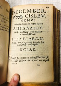
Before diving into the calendar, Eber introduces each “mensis” with a page listing the month’s various names according to the five different calendar varieties presented in the preface. I’ve listed the general formatting guidelines for each introductory page below, using page 401 as an example:
- The Roman title always appears in capital letters at the top of the page;
- It is followed by both the Hebrew and Latin names of the month on the Jewish calendar;
- Underneath lies a numerical word (in this case “nonus”) that explains where the particular month falls on the Jewish calendar (in this case, “Cislev” would be the ninth month);
- Below the Hebrew names are the Macedonian and Attic Greek names for the month;
- Last in the list is the corresponding Egyptian month (which in this case is “Xoiak”)
- The very bottom of every introductory page is dedicated to astrological notes about the Zodiac and the changing visibility of certain constellations during each month
*Notice how astronomy take precedence over hagiography on these introductory pages (as evidenced by its large font); this choice is a subtle indication of Eber’s revisionist objective, which was to create a “reformed” calendar centered around science and modern history as opposed to Roman Catholic saints.
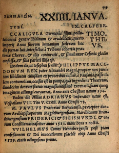
After a month’s divisional title page lies a number of pages dedicated to each day of the month. While some dates are allotted more than one page, no two dates are ever placed on the same page. I have reasoned that this choice was made because each right page is meant to complement the left; in fact, most sets of facing pages in this book are (in terms of layout alone) mirror images of each other. On all left pages, across from the Roman name are the corresponding Hebrew and Macedonian names for each particular month. On all right pages, the format is mirrored, displaying the Attic Greek and Egyptian names for the month in question.
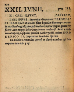

Take a look at the image of pages 232 and 233 for an example, and notice how both dates (in this case June 22 and June 23) are located in the top outer corners of their respective pages. The decision to make the dates so large and visible to the reader demonstrates the intended use for this text; if Eber and Rhau wanted readers to be able to peruse pages and easily find the dates they were looking for, the audience was likely not expected to read this book front to back in one sitting. Calendarium Historicum Conscriptum was probably meant to be referenced— not poured over for hours at a time.
The text blocks below each date vary; some are lengthy and spill over to the next page; other dates have no information listed under them at all. Whenever important figures or events are mentioned, they are capitalized and un-italicized for emphasis. There are also pages with large bodies of text written in paragraph form, wrapped around a narrow column on the outer edge of the page; these columns are titled with large, clear type and usually include information about artifacts, events, and figures relevant to the page’s particular date.
The use of blank space in this book is something that deserves attention; as stated earlier, while some pages are completely filled with text, others are almost completely blank, save for the month names at the top of the page. The placement of blank space is likely deliberate; in fact, in the preface, Eber encourages his readers to annotate the text using its margins and blank leaves. One of the primary objectives for the Calendarium was that it was meant to be a text that displayed contemporary events (this explains why “Martini Lutheri” and his Protestant beliefs appear so often in the calendar). If the blank space in the calendar was truly an intentional choice, it suggests that Eber wanted his readers to be more than mere bystanders to the progression of modern history– he wanted them to actively contribute to this history with the notation of their own timelines in the calendar.
Interesting Notes That Deserve a Mention
- Since the Classical Latin alphabet only had 23 letters, not 26, the letters U and V were allographs. Before the use of the letter U, V stood for both the vowel U and the consonant V. This is why words like “JESUS CHRISTUS” and “MARTINI LUTHERI” are written as “JESVS CHRISTVS” and “MARTINI LVTHERI” throughout the Calendarium.
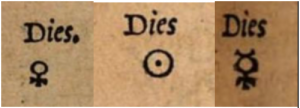 For a small portion of the calendar (beginning on March 10, page 125 and ending on March 17, page 140) Eber places an ancient astrological symbol on all right pages under the date. I am still unsure as to why these symbols are only placed within the month of March, but they are fascinating nonetheless.
 Nearly every page of this calendar has catchwords at the foot of the page to assist the binder. The pages also exhibit signatures (A, B, C, etc.) at the bottom of some pages to help organize the quires, but not all. Other pages have symbols of flowers, clovers, and circles that I believe are meant to help order the text as well (although I could not find any secondary sources that explained the meaning of these symbols).
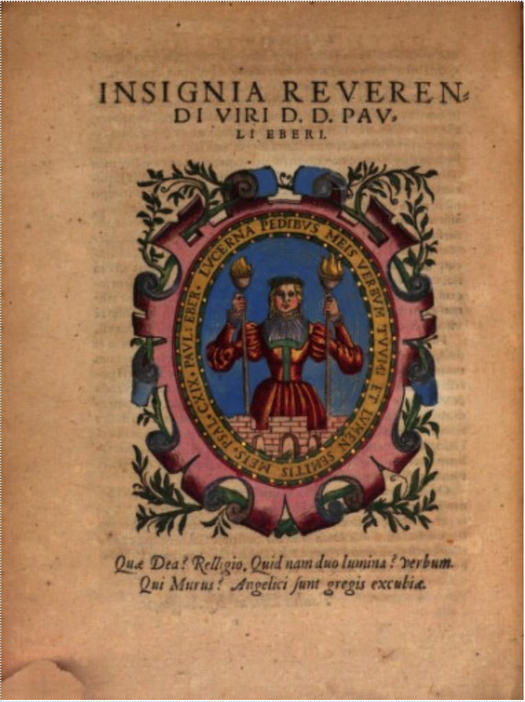
- The book contains multiple historiated initials depicting Christ after the crucifixion and some other Biblical figures. They are black and white in this version of the text, but in Krafft’s version, they are colored. The latter text also includes a large colored picture of Paul Eber holding a torch under his name at the front of the text.
- Colby Librarian Karen Gillum was kind enough to help me translate the Greek miniscule at the beginning of the book. Though this does not have much to do with the “additions” of this book, I find it really interesting that this passage is written in Greek script while the rest of the text is mostly italicized Latin. Since Eber is speaking of ancient history in this portion of the text, perhaps it is fitting that he used an ancient language to convey it. I have placed the translation below (all question marks refer to missing or unidentifiable words in the passage).
“There are indeed many collections of other chronological books which the labor of ancient and recent (men) has given out, but no zeal of anyone has appeared to bring together (collate) months and days. But our Phrank (Frank?) born Heberos, the lord having the name (?) of Paul, and having well decorated and arranged everything, with the embellishments of the histories put forth, and all sorts of deeds having been shown there, and (?) the arrangement of changing seasons, you will find the birth and death of famous men, whom fate has already brought to this life. And the first races of all men, who lived long ago, guared (?) for the use/enjoyment of the light. Someone perhaps, having chanced on this book, will say, I have found a possession better than treasure. So at least some true friend of (?) will say, feeling enormously (?) grateful for it to you, father, Paul, but (?) farewell to us again, companion, receive another offspring from your muses.”
As I close out my blog post, I want to circle back to the McKenzie quote I mentioned at the beginning: “form effects meaning.” When dealing with Calendarium Historicum Conscriptum, this phrase rings especially true. Some could call Eber’s book a casual day-calendar; others could call it a historical text or even an almanac of sorts. The paratext, defined by Gerard Genette as “the means by which the text makes a book of itself and proposes itself as such to its readers,” is what organizes, clarifies, and characterizes Eber’s writing. Without the charts, tables, divisional titles, running-heads, signatures, astrological symbols, font choices, and a myriad of other subtle details, this “polyglot calendar” would be a chaotic jumble of Greek, Latin, and Hebrew. Not only do these additions tell us what kind of book the Calendarium is meant to be, but they imply the text’s intended audience (which in this case is sixteenth-century Lutherans).
Paratextual differences found in other versions of this text, such as the Krafft copies I mentioned at the beginning of this post, convey Eber’s words in a different way. Would the book still be considered “diaristic” without the blank space? Would it be considered an almanac without the index, charts, and tables? After studying these details (often taken for granted by modern readers), I was able to contextualize Calendarium Historicum Conscriptum, bringing forth a trove of new information that would otherwise be lost.
Sources
https://www.wikiwand.com/en/History_of_Western_typography
http://digital.onb.ac.at/OnbViewer/viewer.faces?doc=ABO_%2BZ155914708
https://en.wikipedia.org/wiki/Astrological_symbols
https://kottke.org/19/04/the-history-of-italics-in-type
https://en.wikipedia.org/wiki/History_of_Western_typography
https://www.nyarc.org/content/can-you-read-me-now-brief-history-italic-script